
Page 8 - ETSI-Brand-Guidelines-2018
P. 8
ETSI MASTERBRAND | Logo Proportions
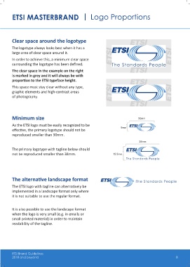
Clear space around the logotype
The logotype always looks best when it has a
large area of clear space around it.
In order to achieve this, a minimum clear space
surrounding the logotype has been defined.
The clear space in the example on the right
is marked in grey and it will always be with
proportion to the ETSI typeface height.
This space must stay clear without any type,
graphic elements and high-contrast areas
of photography.
Minimum size 30mm
As the ETSI logo must be easily recognized to be
effective, the primary logotype should not be 9mm
reproduced smaller than 30mm.
38mm
The primary logotype with tagline below should
not be reproduced smaller than 38mm. 15.5mm
The alternative landscape format
The ETSI logo with tagline can alternatively be
implemented in a landscape format only where
it is not suitable to use the regular format.
It is also possible to use the landscape format
when the logo is very small (e.g. in emails or
small printed material) in order to maintain
readability of the tagline.
ETSI Brand Guidelines
2018 and beyond 8