
Page 3 - ETSI-Brand-Guidelines-2018
P. 3
ETSI MASTERBRAND | Logo Design Explanation
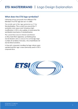
What does the ETSI logo symbolize?
Following various proposals from different ETSI
Members the ETSI logo was born in 1989.
The middle part of the logo symbolizes an ‘S’ for
Standardization. The curved lines around the ‘S’
symbolize radio waves and, following a light
modification in 2011, also a globe, to emphasize the
worldwide importance of standardization.
The curved lines become thinner and thinner
as they meet their opposites, symbolizing how
standardization aims to reduce the confusingly large
number of variations that exist, into streamlined and
standardized solutions.
In line with corporate branding the logo colours were
updated and the logo is now commonly used in ETSI’s
corporate blue.
ETSI Brand Guidelines
2018 and beyond 3